
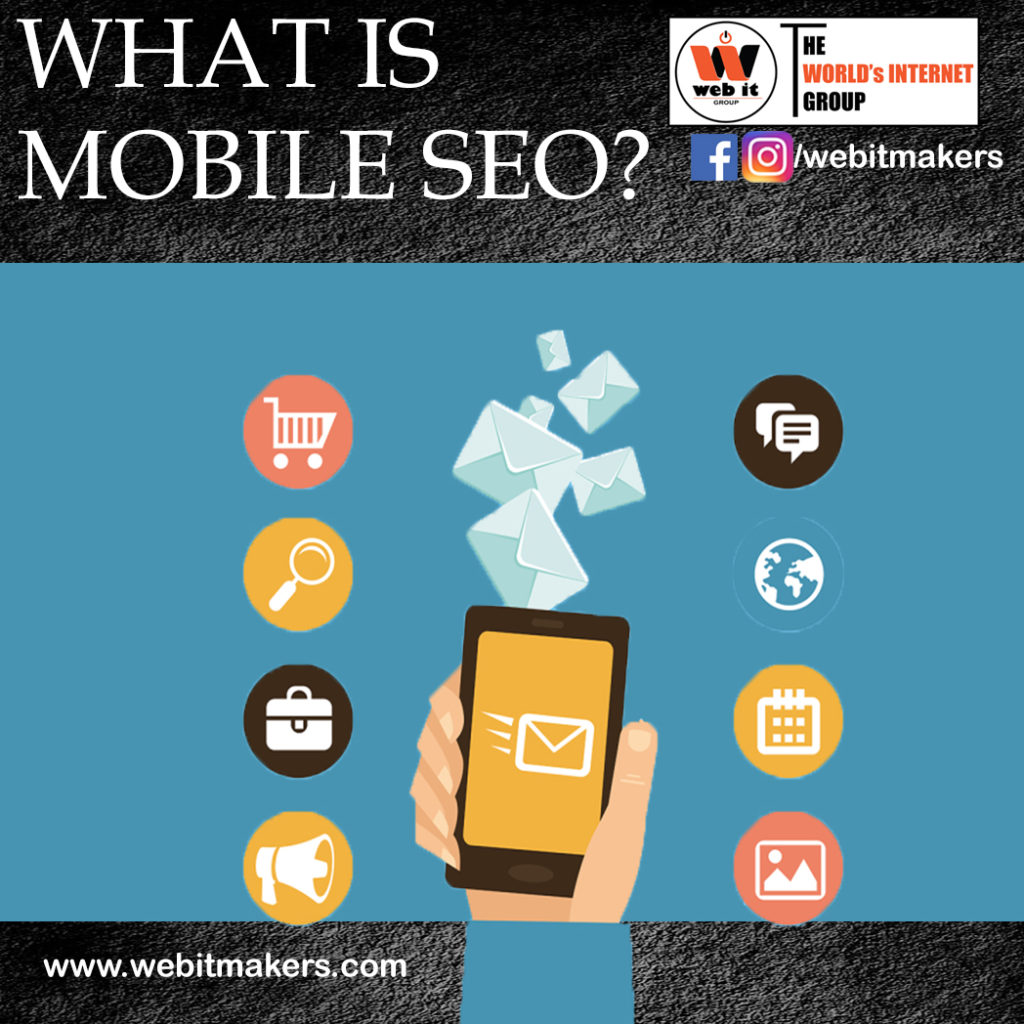

A decade ago, People had no idea of using the internet in such a way that it will become a necessity for everyone’s life. People travelling all around the world and they can’t open their laptops for an instant search or a quick Mail and a message reply. In this era, Mobile is just like a part of everybody’s life From a phone call to a quick search, Everyone has mobile for instant work. So it is mandatory to make your website content mobile-friendly. A mobile-friendly site is all a user needs at this time. Mobile SEO is an easy way of optimizing the site for mobile users. In this, we ensure that our website will rank on smartphones whenever the query is generated through mobile devices. Mobile SEO is important as most of the users are available on mobile phones.
Importance of Mobile SEO
Nowadays Mobile is the most necessary thing and the popular trend that people are following so it will help your business to grow digitally. People found Mobile Browsing is the easiest thing from searching their queries online. Being Digital helps everybody in this era of smartphones. So the use of Mobile applications is more than the use of laptops and tablets these days. And that’s why Mobile SEO plays a very important role in this era.
Google Updates mostly work on mobile devices. The moto of Google is to rank your Mobile Webpage faster because it is easy to rank your webpage on a Mobile device and most of the traffic on a webpage usually comes from Mobile phones.
Mobile SEO is the most important factor for your website in increasing the traffic of your webpage as well as creating traffic to your page.
In the year 2016, Google had announced that Google has launched a new Mobile friendly page testing tool on 7th May and it can be reached by the report of Mobile usability in the Search Console. The work of the tool was to basically to pay attention to mobile speed score of the website. Google considers the speed of your site as a ranking factor according to the algorithm.
Techniques of Mobile SEO
• Title Tag
Keywords in the title tag are a very important factor for SEO It tells search Engine about heading of each page. Keywords are the words that actually bring traffic to your site. Search engines also identify the content of your page based on the certain keyword which your content covers and will rank your page on the result page.
Title optimal length should be 70- 78 characters.
• Meta Description
A curious description will help your website to add more clicks and it will build an interest in the customer’s mind.
It defines the summary of the webpage, the main keywords of your webpage should be present in the meta description. It significantly increases the Click Through Rate of the website which helps in ranking the website on search results.
The optimal length of meta description should be of 155-160 characters.
Don’t let your quality content be missed out due to small screen size. Try to optimize your site according to the different screen sizes.
Use Schema
Schema is a kind of micro data. Schema is the best result out of so many search engine results. It helps search engine to better crawl and understand about your page. Use HTML, It improves the way search engines display your page.
• Keywords
Users’ query is keywords for the company. Your content should contain the keyword in order to rank your page. The optimal density should be maintained by 2-4%.
• Avoid Using Flash
Every Mobile does not have the Plugin that’s why you do not need to add Flash because It may be missed Out from your user’s reach.
Flash websites are not indexed by Google as they don’t provide a unique URL for each page. So, therefore one should about the use of the flash website as your homepage will only rank, you will not able to rank different pages of the website. The flash websites are slow to load and also they do not provide good user experience, therefore search engines do not want their users to go through such bad experiences. So using flash is not a good option.
• Avoid Using Pop-ups
Nobody wants their small screen to fill will a pop-up add. This can keep irritating the user and the user may leave the page.
Since a pop-up ad contains a small cancel button, It may cause frustration to cancel such pop-ups in a small screen. Pop-ups should be avoided on mobile devices.
Learn Digital Marketing from one of the best leading Institutes of Delhi NCR
• Responsive Web Design
The website should be to be designed according to the different screen sizes of mobile phones so that the users do not miss out on the content that you have created for them. Your website should be compatible with all mobile devices such as tablets, smartphones, iPhones. Search engines always rank the website higher if the website is mobile-friendly.
Pros of Responsive Web Design
Low Maintenance Cost
It will take a very low maintenance cost. It is cheaper to maintain layouts of any new device but costly and harder to make sites for managing several devices.
Search Engine Ranking will Improve
With the great experience to the users, the traffic on your website starts increasing and this will ultimately be reflected on your website Search Engine Ranking. Your Ranking will significantly improve on the Search Engine Result Page.
• Call to action
Call to action to attract customers for sales. It is as a quick response. A call to action button should be there to attract the customer so that they take interest in your site. For example- Provide a discount to attract customers.
Important Mobile SEO tools
•Search Console
Search console is a platform in which a website owner can actually connect with Google about any issues, it also has the feature by which one can test the mobile responsiveness of his website. The tool will help the website owner to know is his website is mobile-friendly or not.
To read more about Google search console
• Test My Site
The Idea behind the tool Test My Site is amazing, it was to measure the site’s performance across devices. The devices from tablet to PC to Mobile phones, etc to connect more quickly.

• GT Matrix
GT Matrix is a tool that is used for getting detailed reports about your site’s performance. IT analyzes the page speed and a free tool also.

• Page Speed Insights
Google’s Page speed insights tool is for analyzing the site’s front end performance and also gives suggestions to optimize your site. It provides the score to your website between 0-100.

How to improve Mobile SEO
At this time when almost everyone is using Mobile Phones, you should also create a mobile responsive site design for those who do not prefer the desktop, the laptop or which can work perfectly on mobiles.
Quick loading speed
Quick loading is a very important factor of any website. If a user visits your website and the speed of your website is slow, The user may change the mind and leave your website. So remember, the loading speed should not be more than 6 sec. Optimize with a site with such images and content that loads faster even in a mobile device.
Optimize your Site for local search
Always try to make sure that your website content is useful for a local search if you have local access in your business. In Local search, there are many things like Mention Your name, Place (the address that is reachable to you), Your city name, Contact Information in your site.
Improved User Experience
People nowadays prefer to shop online than to go to the market and spend their time and energy both. Now the audience has become smarter and got to know where they should invest their time that’s why people download different Mobile Apps and shop Online. Mobile SEO is needed the most in shopping sites because people choose online shopping platform to save their time and if your site will take time to load images, It can be irritating for the customers and they might leave. Mobile SEO helps in improving the User experience.
There is a big difference between a mobile device screen and a desktop screen size. Whenever a mobile opens any link, It should fetch in seconds. And the overall response will be according to A mobile device smooth and fast loading page. Due to responsive design, Many users can visit your website from different screens or devices. It is easier for them and for you also.
If you want your site to be fitted according to different screen sizes, use Responsive Web Design while creating a website.
Avoid your site from SEO Dilution
If you are using many links for different screens like one for desktop and another for Mobile, your SEO Authority may be diluted. So try using the single link and make your mobile site easy to access by a single link and a single click.
Is is important to have Optimization In mobile SEO?
Yes, most of the optimization is done for Google, so optimization for the mobile site is necessary. In today’s time, most of the searches are done from Mobile Phones.
Google Mobilegeddon Update
Google’s mobile-friendly update brought many changes in ranking and SERP. Mobilegeddon the first Mobile-friendly Update was launched on 21st April 2015 by Google. There is either black or white side of your website means Either your website is Mobile friendly or not, and there is no in-between.
Effects of Google Mobilegeddon update
1- The first effect you can see on the search ranking of different Mobile Devices.
2- The second effect is language search result in all global languages.
3- It has the effect on the page of the website not on the whole website.
So these were the major effects for your website which is Mobile-Friendly.
This was the update by which Google had planned to change the whole market scenario and the market was ready to adapt changes brought by Google.
The main and appreciative thing about Google is, It always tries to do something better and better that may improve User experience and always bring something new, Unique and better in the market.
Basically, the update was not only about Organic search but for the user experience and response also for the behaviour of the consumer. And believe me, that is one of the best thing done by Google.
After Watching so many efforts by Google, You must think why does Google care so much for it’s user? But you have slightly an Idea that Google makes money from lots of paid ads. Google wants to give the best user experience to its users so that users start on clicking on ads and raise the funding for the free services to Google.
As we all know it was stated by Google that the updates of Google Mobilegeddon would be greater than Google Panda Update and Google Penguin Update. But people working in industries found their sites fairly better and people tried to criticize this update by Google. But deep down we all know the ability of Google.
Mobilegeddon Heritage
By the end of the time, Google has to update a few things on Google Mobilegeddon Update and made it better again according to the user experiences. such as-
1- People can make changes on their website on the other side of the traffic of their website and allowed people to change their site design as they want.
2- Each and every Algorithem Update was easy to understand by Users.
3- When people are already aware of upcoming changes, it is easy for them to accept it.
These are few things to understand about Google Updates are, it Is a better way to communicate the users and to improve user experience by Keep updating according to the trend.